The Arrow Trick
Gradient Doesn’t Equal Interesting
Jun 6, 2025
Read time:
1
minutes

Sasha Mozdir
Indie creator
Gradients are everywhere — easy to drop on a button, a font, a background. But let’s be honest: most of them look… cheap.
Why?
Because a gradient alone doesn’t say anything. It’s just a color shift. No depth. No story. No intention.
Here’s what actually makes a gradient interesting:
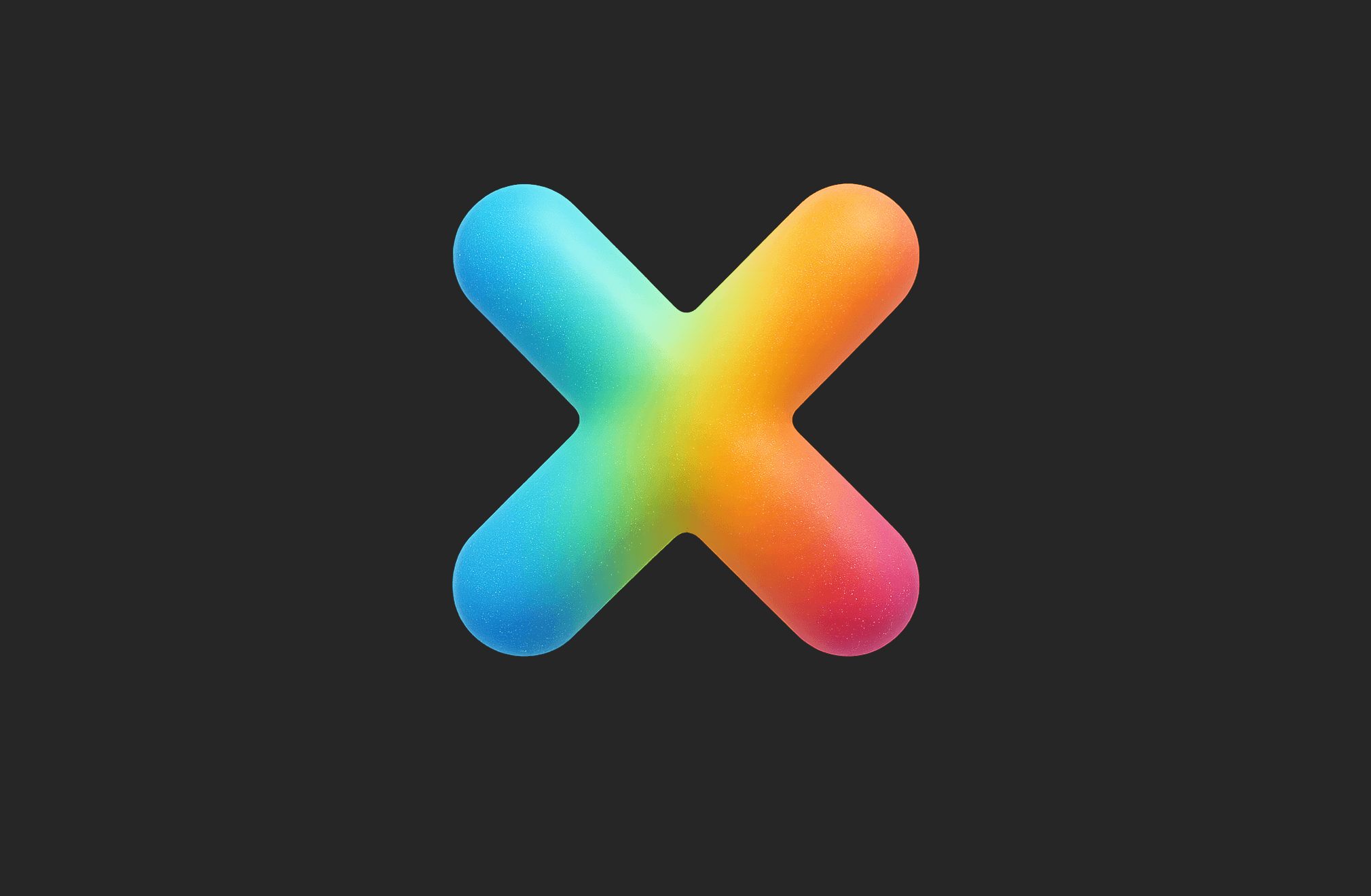
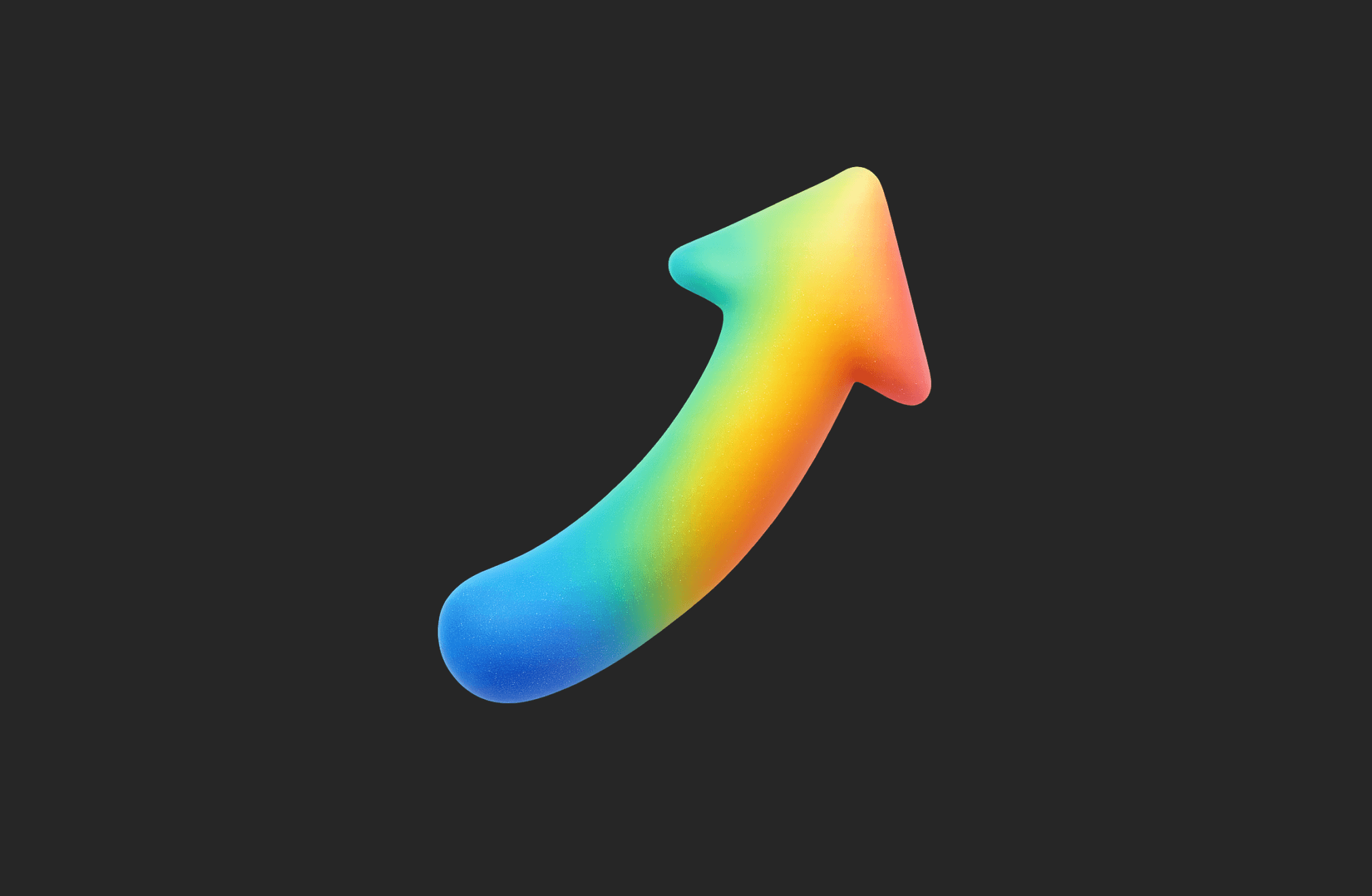
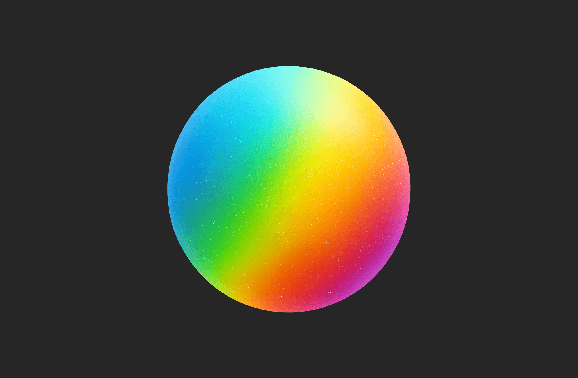
Form + color contrast.
Gradients love curves, blobs, volume — not flat rectangles.Texture & noise.
A little grain goes a long way. Adds realism, removes that plastic look.Light & shadow.
Without light, colors feel dead. A soft highlight can change everything.Color logic.
Not every rainbow works. Choose a flow: warm to cool, saturated to muted — give it a direction.
Quick Fix:
Blur it
Add soft noise
Overlay a lighting layer
Now your gradient tells a story.
Fonts I Keep Coming Back To